
Organizational Structures Week 4 Discussion
1. Each design toolbox contains a brief narrative. In your opinion, does each narrative accurately explain the project? Why or why not? Provide references to page numbers in the project books to substantiate your statements.
The KangaROOS narrative is very brief. It accurately explains the product and goals behind the “Color Your Roos” project, but doesn’t mention any design decisions or discuss any reasoning behind them (Niebrugge, n.d.).
The first paragraph in the Schweitzer narrative states that the goal of the rebranding effort is “to connect with the local populations and breakdown the accessibility barriers” (Niebrugge, n.d.). It discusses using imagery that is focused on the area and people, and states that the design elements do not overpower the imagery. There is a strong graphic design element going through the project book that is not present in the toolbox. Throughout the piece the strong curving line divides and dominates each page. The photographis images are in circles. I think these design elements overpower the imagery. The photographic imagery on the cover for example is very small in comparison to the graphics. The project book contains a photo of a tour bus with the tagline “Reaching the Extreme in Your Backyard” on each side (Niebrugge, n.d. Pages 4.6 & 4.7). This is a nice tie in with the original goal of the rebranding effort.
The Woofables narrative accurately explains the project. It explains the goal of the rebranding, color schemes, fonts and textures, and the reasoning behind the design choices. The narrative states, “The design will be clean and classy with a whimsical touch” (Durko, n.d.). This theme is also addressed in the brand book (Durko, n.d. page 23). The narrative also explains in detail the thought behind the new logo design, which is “symbolic of a happy dog who enjoys Woofables many tastes and scents” (Durko, n.d.). The logo design process is well illustrated in the project book (n.d. page 29 & 30). It is a successful logo design.
The Discover Korea narrative discusses the goal of the rebranding effort being to increase tourism from the US and also in other countries, and to increase Korea’s overall international reputation. I think it should have had a more focused goal and target audience. It explains the thought behind the new logo, which I think is an effective logo design. In my opinion, the narrative accurately explains the project. The imagery used is in the toolbox and in the project book is consistent, and it is good imagery, but there is way too much of it. It is overwhelming and should have been edited more.
The MySpace narrative discusses the problems with the current brand and website in general. It goes on to suggest what should be done to change the site’s philosophy, but doesn’t say anything about the graphic design of the rebranding project. The only mention of design is vague, stating “Multiple styles are represented in the imagery/textures area to display different design solutions for alternate media” (Staebell, 2011). I think there should have been a more detailed description of the design choices.
2. Do the media applications shown in the project books appear to be derived from the toolboxes exactly, or were changes made between the toolbox and the project book? Explain. Provide references to page numbers in the project books to substantiate your statements.
The media applications in the KangaROOS project book seem to be extensions of the choices made in the toolbox. The biggest change in the project book has to do with the use of color. The dark photos and white background in the toolbox create a more somber feel than the bright and vibrant purple background (n.d. pages 1, 2 and 67), the blue background (n.d. pages 4, 15, 28, and 52), the bands of blue used along the bottom of several of the pages, and the brightly colored title boxes used throughout the book. The colorful, very nice new logo design shown in the project book (n.d. page 7), and throughout the book made a big difference in the appearance as well. Overall the project book has a much more vibrant and happy feel.
The media applications shown in the Schweitzer project book seem to have progressed form the toolbox. The same fonts, photographic imagery, textures and some of the design elements are used. The addition of the strong graphic design elements changes the feel of the piece dramatically. The toolbox has a mountain scape across the bottom of it that is not used in the book. The color palette on page 3.3 of the design book is also new.
The media applications shown in the Woofables project book appear to be derived from the toolbox. There are some additional design elements that were incorporated into the project book that are not in the toolbox. On page 2 a multi colored stripe goes vertically down the page. The same colored band appears through the book horizontally across the bottom. The headline font is enhanced in the book with wavy path and the faintly outlined use of all caps. I think the Woofables project book corresponds closely to its toolbox, but it has a slightly different look and feel. Its toolbox has a border around it with rounded corners that is presented on page 14 in the project book. The overall look and feel of the project book is more refined and classy than the toolbox.
The media applications in the Discover Korea project book have some of the design elements from the toolbox in them with the addition of a lot more. The texture that is in the first box in the toolbox is a nice touch as side panels throughout the book. I don’t see any of the other sample textures that are represented in the toolbox in the project book. Both the toolbox and the project book have a lot going on.
3. Of the 6 design toolboxes shown, which project book is closest to its corresponding design toolbox? Why? Provide references to page numbers in the project books to substantiate your statements.
The MySpace project book is closest to its corresponding design toolbox because the project book has the same look and feel as the toolbox. The banner at the top of the page, and the white background in most of the pages is consistent in the toolbox and the project book. The media applications in the MySpace project book appear to be clearly derived from the toolbox. There is the addition of the photo collage texture that is shown clearly on page 7, and appears at the top of the pages throughout and on the front and back pages. The addition of the photo collage texture is a nice addition to the piece. It works nicely with the theme, and doesn’t deviate form the original design narrative because it has the same feel as the blue texture element that was originally presented in the toolbox.
References:
Niebrugge, P. (n.d.). Color Your Roos Project Book. Retrieved April 24, 2014 from http://issuu.com/mdmfa_dsr/docs/niebruggep_projectbook?e=1552580/2554785
Creighton, C. (n.d.). Schweitzer Mountain Resort Rebranding Project Book. Retrieved April 24, 2014 fromhttp://issuu.com/mdmfa_dsr/docs/12.4.3_creighton?e=1552580/2554803
Durko, K. (n.d.). Woofables Project Book. Retrieved April 24, 2014 from http://issuu.com/mdmfa_dsr/docs/12.4.3_durko_issuu?e=1552580/2554837
Snowberger (n.d.) Discover Korea Project Book. Retrieved April 24, 2014 from http://issuu.com/mdmfa_dsr/docs/12.4.3_snowberger_issuu?e=1552580/1720197
Staebell, M. (2011, April). MySpace Brand Renewal. Retrieved April 24, 2014 from http://issuu.com/mdmfa_dsr/docs/12.4.4_staebell?e=1552580/2554882
6.4.1 Week 4 Reflections
Learning How to See
Oliver Reichenstein’s article “Learning how to See” talks about our life long adventure of developing a design eye. He states that “Seeing is not a passive act. We see what we expect to see, or, as Anaïs Nin put it so beautifully: ‘We don’t see things as they are, we see them as we are’” (2013). We each bring our own perceptions into whatever it is that we are looking at. As we experience and learn about what design is, we are more able to recognize good design by noticing different design elements, and how they interact to convey meaning. We see things differently. As he says “Designers see more, and more precisely” (2013).
“…we don’t see that we don’t see.”— The Tree of Knowledge, Maturana & Varela
An example of this concept that happened yesterday comes to mind. I am working on a brand design for a company that my brother is starting. I had sent him an image that I had worked on for some time. It was pretty polished and finished. He responded with some instructions on changing the shape slightly. I very quickly sketched out the new shape and sent it to him as a very rough draft. He responded that the new shape was exactly what he had in mind, but he liked the first image better. He didn’t really know why, he just knew he liked the finished image better.
As designers, it’s important for us to realize that we see things differently and why, and also to be able to communicate the difference. We need to learn design terminology and language and be able to speak intelligently about what we see. “Designers see more, and more precisely. Part of our job is to make the invisible visible, to clearly express what we see, feel and do” (Reichenstein 2013). We need to get past the idea of explaining design ideas in terms of taste.
“Good design is when I like it”— Everybody
Good design is aesthetic, but as designers we are challenged to present design that conveys a message for a specific purpose. The most important thing to consider is how it works. As Reichenstein says “the aim of design is to facilitate use, and take care of details that are tedious for the inexperienced person” (2013).
“Design is not just what it looks like and feels like. Design is how it works.”— Steve Jobs
Up until this point, as I have discussed the company that I’m rebranding I have thought a lot about their history, what they stand for, and how they currently present themselves. The company has an interesting history, which I like. I like their products. I don’t like heir current brand. I didn’t really know why, I just knew I could do better. I have always viewed design in terms of how I liked it. This month I have really started look at design beyond it’s initial aesthetic appeal to discern why it works. We have studied how design elements convey emotion. We have begun to think of ourselves as designers, and practiced communicating as such. I’m thinking a lot more about how design works. In the process of designing my mood boards, I have been focused on conveying three distinctly different feelings. Going forward I will slightly shift my focus to be more on how the design works and how it will be perceived by the target audience that I have identified. A theme that has emerged for me throughout this program is that good design has to be distilled down to only the most essential elements.
“Good design is thorough down to the last detail — Nothing must be arbitrary or left to chance. Care and accuracy in the design process show respect towards the user.” — Dieter Rams
Reference:
Reichenstein, O. (2013, March). Learning to See. Ai. Retrieved from http://ia.net/blog/learning-to-see/

Theme – Vintage/Adventure/
Narrative – Wearing M.Nii clothing is like being on a Hawaiian vacation.
Style –Contemporary /Art Nouveau
Strategy – Warmth/Fun
Theme – Local/Casual
Narrative – M.Nii is the cool, casual, clothing that local surfers wear while they are at the beach surfing, and hanging out afterward.
Style – Contemporary
Strategy – Cool/Laid Back
Theme – Creative/Modern
Narrative – This is a story about the artistic individuals that are out there surfing, making art and music, and wearing hip, retro clothing.
Style – Contemporary
Strategy – Clarity

Theme – Cosmic/Fantasy
Narrative – Bringing cutting edge technology into the present, Tesla is the car of the future that is here today.
Style – Contemporary style that has clean elegant lines.
Strategy – Using cosmic images, sharp images of beautiful cars, and a vintage photo and quote of Mr. Telsa to convey a sense of timelessness.

Theme – Tranquil
Narrative – This is a mountain retreat resort and spa. It’s the place to go where you can go to get away from it all, into nature and completely relax.
Style – Contemporary style is the inspiration for the overall look because the simple clean lines convey tranquility.
Strategy - Water, nature, clean lines, soft textures and warm colors combine to create a serene, inviting setting.

Theme – Local/Casual
Narrative – Farmer’s Market is a fresh food, pet friendly café. It’s a place to meet your friends for lunch, and you can take your well-behaved pooch if you want to.
Style – Is American Kitsch, because it has a friendly vibe.
Strategy – The design strategy is to create a fresh country, friendly inclusive atmosphere using bright, earthy colors, nubby textures and crisp happy images.

Design Research Discussion 1
Narrative
Hotel del Coronado is a luxury beachfront hotel in the city of Coronado, just across the bay from San Diego, California. It was designated a National Historic Landmark in 1977. The narrative of the hotel’s brand is in its history. When it opened in 1888, it was the largest resort hotel in the world. It has hosted presidents, royalty, and celebrities through the years. The hotel has been featured in numerous movies and books. Since it was first built more than 120 years ago, the Hotel del Coronado has been a definitive example of what a luxury resort should be. People are attracted by the chance to become a part of its history. To stay there is like going back in time, but more comfortable.
Strategy
The hotel’s design strategy combines its historic charm with contemporary luxury, while the white sand and the ocean spreading out in front it promise spontaneous fun.
“Design strategy could be described as inventing the language to express your client’s business strategy most clearly. Jamie Koval, president of VSA Partners in Chicago, puts it this way: ‘Design strategy articulates the parameters and potential of a specific challenge that drive a series of solutions or result. It’s simple, compelling and actionable’” (Stone 2013).
Theme
The theme for Hotel Del Coronado’s brand comes from its history and its elegant Victorian architectural style. Everything about the brand from its promotional pieces, its signage, the rattan chairs, to the clean white paint and red roof communicate the theme of the hotel’s legendary history. “Graphic design also works on multiple levels. Each level is important, because a story needs to be told, but that story is really just a vehicle for the theme” (Curtis 2013).
Style
Hotel Del Coronado is one of the few surviving examples of an American architectural genre: the wooden Victorian beach resort. The hotel’s logo uses a silhouette of the iconic dome, and a Victorian inspired font combined with a more contemporary font. The use of red white in the logo and all of the promotional pieces adds a clean, sophisticated and regal simplicity to the undertones of the Victorian style. The checkerboard motif hints at Victorian style, but it also ads a contemporary flair and a touch of fun. “As designers, storytelling is what we do visually. We set a tone, we inspire, we invoke change and thinking through design. We do that with style, with color with shape and form. Storytelling is in essence, how we problem solve and create an experience for our audiences” (Subasic 2013).
References:
Curtis, H. (2013). MTIV: Process, Inspiration and Practice for the New Media Designer, 1/e Vitalsource eBook for Full Sail University. Pearson Learning Solutions, 12/2011. VitalBook file.
Hotel del Coronado images. (2014). Hotel del Coronado website. Retrieved from http://hoteldel.com/about-our-san-diego-resort/
Stone, T. (2013 February). Understanding Design Strategy. Retrieved from: http://www.howdesign.com/how-magazine/how-march-2013/understanding-design-strategy/#sthash.o7kkJcqa.eycNN67l.dpuf
Subasic, A. (2013 August).Outside the Design Box: Story Story Night Retrieved from http://idaho.aiga.org/outside-the-design-box-story-story-night/#sthash.MetWTB9X.dpuf See more at: http://idaho.aiga.org/outside-the-design-box-story-story-night/#sthash.MetWTB9X.dpuf
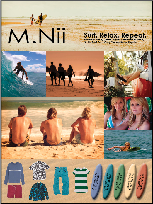
M.Nii
Target audience: 20-40 year old people of middle to upper income who live the surfer lifestyle. They are easygoing, open minded, creative, productive, generous professionals who work in a field or trade that they love. They love the arts, have eclectic taste in music, and are creative and well educated. They are family oriented, socially and environmentally conscious. They value peace, integrity, kindness, spirituality, history and equality. They love to travel to exotic places where there is water. They are active, healthy, athletic and fit. And they have a lot of fun.
CLASSIC ALOHA STYLE.
Built for charging big waves… and relaxing inland.
M.Nii was there when big wave surfing took off in Mahaka, Hawaii post-WWII. When all surfers had to rock were cutoff sailor pants, which couldn’t hold up to the pounding surf. Just off the beach in a small tailor shop, M.Nii went from repairing torn britches to creating the world’s first surf trunks. M.Nii’s Mahaka Drowners are a badge of honor from surfing’s holy land. The original Drowners are available alongside a full collection of very relaxed clothing. Awesome T-shirts, comfy chinos, and sick vintage inspired surf club jackets will keep you fresh inland, while the Drowners will let you charge all day long.
Live Aloha. Visit www.mnii.com
M.Nii Taglines
1. Classic aloha style.
This tagline is a description of the clothing line that originated in Hawaii.
2. Explore more beaches.
Refers to a part the surf lifestyle that is attractive to the target audience.
3. Live aloha.
The uplifting word aloha refers to the brand’s roots in Hawaii.
4. Surf more.
Even though part of the target audience doesn’t even surf, they like the idea of it.
5. Relax in style.
Relaxing is an important part of the surfing lifestyle, and the clothing is casual relaxed clothing.
6. Play more.
It’s an invitation to have fun, which attached to the clothing line.
7. Don’t worry, be happy.
The phrase refers to a reggae song that is part of surf culture.
8. No ka oi
It is a popular phrase that means “the best” in Hawaiian.
9. Indestructible comfort.
It’s a play on the contrasting characteristics of the brand that is made to take the pounding surf and also be very comfortable.
10. Surf. Relax. Repeat.
It points to the fact that the clothing line is made for surfing and also relaxing in.


M.Nii - CLASSIC ALOHA STYLE
M.Nii - Classic Aloha Style
Marcia Coles
Full Sail University
March 2, 2014
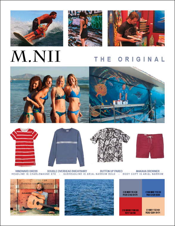
The story of M.Nii begins in the 1950’s when a local tailor right off the beach in Makaha, Hawaii designed and built the “bulletproof” “Makaha Drowners” to withstand surfing the powerful waves. In 2012 the M.Nii brand was revived. The exact patterns and methods of construction are now being used in a line of clothing that includes the trunks, as well as a full line of classic laid back casual clothing. This research paper discusses how a focused rebranding of the revived M.Nii surf apparel brand will build brand awareness, elevate its image and exposure, and position M.Nii to be more competitive in commanding its share of the $126 billion surf apparel market sector. The brand’s target audience is clearly defined. Relevant current social and fashion trends are evaluated. The elements of typography, color scheme, image and graphic design choices made to sharpen the brand’s visual image are discussed. A cohesively integrated fresh new brand identity with optimum promotional exposure spread across multiple media platforms is presented and explained.
Once a sport reserved for Hawaiian royalty, or alii in Hawaiian, surfing or hee nalu, is often called the “sport of kings.” King Kamehameha I was known for his surfing ability. In the early 1900’s Duke Kahanamoku spread aloha by teaching visitors how to surf. In the 1950’s, when surfers began to ride the powerful winter waves of Makaha on Oahu’s west shore, a lifestyle was born. In a local tailor shop in Makaha in 1951, M.Nii developed the famous “Makaha Drowners,” which have a legendary existence in surfing. Inspired by the dawn of the surfing lifestyle, a revival of the original M.Nii brand was launched in 2012, offering the same simplicity of design and quality of construction that was found in clothing harking from that era. This paper discusses how a focused rebranding of the revived surf apparel brand M.Nii will build brand awareness and position M.Nii to be more competitive in the surf apparel market sector. The theme behind the M.Nii rebranding campaign is to build on the brand’s established subcultural credibility. While maintaining the vintage feel, the brand’s image will be tuned and sharpened to make it more relevant to today’s target audience. The company needs a strong web and social media presence. Creation of a robust website, tablet, and mobile app with beautiful imagery will promote online shopping. M.Nii will also be aligned with the Surfrider Foundation, a grassroots nonprofit environmental organization dedicated to the protection and enjoyment of oceans, waves and beaches through a powerful activist network. Association with the Surfrider Foundation will strengthen the M.Nii brand by building on subcultural credibility.
Makaha, Oahu is the birthplace of big wave surfing. According to writer James Harris, “Makaha’s status as a legendary big wave surf spot is mostly due to a group of Californians who created the Hot Curl board to handle the waves, and a surfing contest to name a champion of the newly modified ‘sport of kings’” (Harris 2013). When the waves got the better of their board shorts, the surfers went to a little tailor shop to have them stitched up. Minoru Nii, the tailor who went by M.Nii, began making twill shorts that were as durable and bombproof as the cutoff sailor pants many surfers wore, but fitted for surfing. These are what became known as M.Nii’s Makaha Drowners. Makaha Drowners were not only popular for their long-lasting construction; they also became a status symbol of hardcore surfing. Wearing a pair back on the beaches of California meant you had tackled Hawaii’s monstrous waves and met with M.Nii. Because the Drowners were never sold commercially, the shorts are rare and belong to a particular crowd and time.
In 2012 surf industry veterans Randy Hild and John Moore brought the M.Nii brand back to life. Hild and Moore have recreated the M.Nii’s Makaha Drowners down to obsessive detail. Speaking with fashion editor Karen Day, “We mimicked the original as close as possible,” explains Hild (Day 2012). They follow the same style of tight stitching and identical button flap back pockets, he explained to Harris. “This season’s collection pays tribute to the Windansea Surf Club—a group of Southern California surfers who would travel to Makaha to charge the massive waves—with a surf club jacket that heralds this coming-of-age era of surfing. There’s also a Hang Ten-inspired striped tee as a salute to founder Duke Boyd, who was a huge fan of M.Nii, and modeled the Hang Ten trunks after the Makaha Drowners” (Harris 2013). It’s clothing that anyone can have in his or her wardrobe and the quality is really good.The clothes are casual, easy, and you don’t have to be a surfer to wear them.
Competition in the surf apparel market is fierce with popular brands such as Quicksilver, OP, Vans, Oakley, Volcom, Hurley, Billabong, Rip Curl, and RVCA to name a few. “The world surf apparel industry is expected to exceed $126 billion by 2015, according to Global Industry Analysts. The market is driven by a trend toward healthier, more active lifestyles, with older demographics and women becoming more active” (Reports Linker 2014). And the trend is international. John Felenthal of the New York Times states, “Surf culture in Japan has gained enough popularity as of 2013 that even non-surfers are adopting surf-inspired clothing style and aesthetics” (Felenthal 2013).
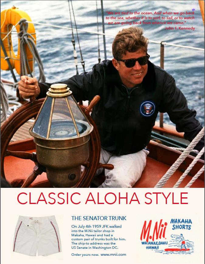
To compete in this market, M.Nii needs to build brand awareness and establish their differentiation. A focused rebranding of the revived surf apparel brand will build on M.Nii’s established legendary subcultural credibility, while fine tuning and sharpening their image, making it more relevant to today’s target audience. The vintage logo that the brand is now using has some recognition value, so it should not be completely abandoned, but as Hild notes, “The dormant label is so obscure, if you’re under the age of 70 and surfing, you kind of don’t know about it” (Day, 2013). While maintaining the vintage appeal, the brand logo will be reworked to give it a little edginess and a clean, retro hip feel.
The main differences between M.Nii and the competitors are their style, attention to detail, and quality of construction. M.Nii is still building their Makaha Drowners with the same button-fly fold over tab and notched-corner pocket shape with double-button patch and flap construction that the originals from the fifties and sixties were built with. The flat-cut waistband and contoured side seam allows the shorter length to sit lower on the hips. These features define the soul of the M.Nii brand. The shorts are constructed with 16 to 18 stitches-per-inch, making the garments impossible to rip. Most manufacturers don’t even want to do the stitches-per-inch requirements, because it’s time consuming and costly. M.Nii brings the same mentality into the rest of the collection. The same hands-on approach and attention to detail as the tailor shop did sixty years ago. Another difference is that 100% of M.Nii’s product is built in Los Angeles. They don’t send anything to factories overseas.
A current trend in men’s clothing is a more tailored swim short than the boardshorts that have been popular in recent years. Speaking with fashion editor John Ortvid, Bloomingdale’s men’s fashion director Josh Peskowitz explained, “Paying more for nicely fitting trunks is just a part of the larger trend of men spending more time and money on their wardrobes. If they’re investing in the right jeans, the right tie, the right suit and the right sneakers, of course that’s going to extend to swimwear” (Ortvid 2013). M.Nii shorts are tailored to fit the body, a detail that should be promoted, to ride the trend. As design guru Marty Neumeier says, “When focus and differentiation are powered by a trend, the result is a charismatic brand that customers wouldn’t trade for love nor money. It’s the difference between paddling a surfboard and riding a wave” (Neumeier 2013). A clothing-manufacturing trend is to be socially and environmentally responsible. M.Nii can ride the wave with this trend by demonstrating that they are committed to using sustainable materials, recycling, and aligning with the Surfrider Foundation.
The Surfrider Foundation is a grassroots nonprofit environmental organization dedicated to the protection and enjoyment of oceans, waves and beaches through a powerful activist network. The core activities and campaigns that the Surfrider Foundation champion fall into the categories of Clean Water, Beach Access, Beach Preservation and Protecting Special Places. Association with the Surfrider Foundation will strengthen the M.Nii brand by building subcultural credibility, bringing it into the tribe. “Customers today don’t like to be sold—they like to buy, and they tend to buy in tribes. Better advice for companies is to focus their communications not on a USP—Unique Selling Proposition—but on a UBT—a Unique Buying Tribe—that has a natural affinity for the company’s products or services. In a tribe, news spreads quickly, which gives brands extra traction” (Neumeier 2013). M.Nii manufactures 100% of their product in Los Angeles. Promoting local commerce is good for the local, State and National economy. Supporting the Surfrider Foundation by donating a portion of their proceeds and sponsoring local Beach Cleanups, and events like the Helen Woodward Animal Center’s Annual Surf Dog Surf-A-Thon, held at Dog Beach in Del Mar would give M.Nii traction.
A brief profile of M.Nii’s target audience is 20-40 year old people of middle to upper income who live the surfer lifestyle. They are easygoing, open minded, creative, productive, generous professionals who work in a field or trade that they love. They love the arts, have eclectic taste in music, and are creative and well educated. They are family oriented, socially and environmentally conscious. They value peace, integrity, kindness, spirituality, history and equality. They love to travel to exotic places where there is water. They are active, healthy, athletic and fit. And they have a lot of fun.
While at the core of M.Nii is a legendary historical base, the company needs a strong vision for the future. “A company’s core purpose gives it a heading, a direction toward the future. While a company’s purpose can be abstract, a company’s vision should be concrete. It’s an illustration of the future—a picture shared by the entire company. ‘A soul never thinks without an image’,” said Aristotle, and a company never acts without a vision” (Neumeier 2013).
The theory behind this campaign is to take the legendary historical significance of the original M.Nii brand that has already been established, give it a fresh new life and make it relevant to today’s target audience. At the soul of the brand are contrasting characteristics that will be addressed in the graphic design choices. There’s the duality in its image of being a line of clothing that has bulletproof construction, made to hold up surfing in thunderous waves; and it’s very laid back, casual and comfortable for relaxing in after the surf session. The campaign will also weave the classic nostalgic elements of the brand’s historic beginnings with the cool, clean, current vibe in the culture of today’s target audience.
One element in the design is typography. As writer Peter Barber points out “Typography is about the way we form language into pictures. It is where the literary and visual arts rub together and make sparks. And those sparks are visible to anyone who wants to see them” (Barber, 2012). Font choices, as well as how the text blocks are arranged will accommodate this duality of the brand’s characteristics and make sparks. The composition of the promotional pieces will have plenty of open space balanced with beautiful imagery, and water. The text blocks will be of a clear modern font such as Avenir Next that is easy to read and complements the beautiful imagery. The font used in the new logo is Serge Black OT, designed by Cyrus Highsmith. It gives a nod to the vintage logo, but has a sophisticated feel. As Nicole Dotin of Typographica notes “Strains of the 1950’s echo through Serge, but (and crucially) those aren’t the only notes you’ll see. Cyrus draws on his multitude of interests and combines the spirit of a previous era with his own angular sensibilities to create a type design with no obvious counterpart. Inevitably, Serge will be used in design pieces to recall the ’50s but I can’t wait to see it set in a contemporary context where its newness and unique qualities prevail.” (2013).
Quoted in Psychology & Marketing Marc Chagall said, “Color is all. When color is right, form is right. Color is everything, color is vibration like music: everything is vibration” (2013). The full color palette in this theme is mostly blue with the split complementary colors of green and red-orange. In Color Matters J.L Morgan states “Blue ranks so high as a favorite color that you can’t go wrong if you use blue. However, blue can be over-used and may wind up a design cliché if used alone. Combining blue with another color creates a more creative effect.” The intensity of the colors is slightly muted to give a soft effect evoking vintage Hawaiian travel posters. The images include photos of surfers riding big curling waves, as well as beautiful images of folks relaxing and playing in exotic beach locations. The design reflects the dualities in the theme of the campaign: The old and the new, charged and relaxed. The subjects in the photos will be active, hip looking people having fun, but the treatment of the images will give the pieces a cool, laid back, vintage feel.
The brand will have a cohesively integrated identity with exposure spread across multiple media platforms. “All brand innovation, whether for a website, a package, a product, an event, or an ad campaign, should be aimed at creating a positive experience for the user” (Neumeier 2013). A strong web and social media presence is part of the vision. Creation of attractive, engaging, robust website, tablet and mobile apps with beautiful imagery that are fun and interactive will build brand recognition and promote online shopping. Print ads will be an integral part of the campaign. Journalist David Williams reminds us “Let’s not forget that 21.6 million adults still read a printed newspaper each day. This is something we should not lose sight of as we journey through new technological advancements. Readers of magazines and newspapers have a unique relationship that is hard to replicate with other media. The digital journey we are now firmly on means that the additional opportunities for advertisers can be outstanding” (Williams 2014). The rebranding campaign will also include outdoor advertising formats for billboards, public transportation media boards, and posters that will tie in with the other promotional pieces, bringing them all together into a cohesive brand image.
The international surf apparel industry is expected to exceed $126 billion by 2015. The market is driven by trends toward healthier, more active lifestyles, with older demographics, women, and non-surfers adopting surf-inspired clothing style and aesthetics. A focused rebranding will build brand awareness, establish differentiation and position M.Nii to be more competitive in the industry. It will build on M.Nii’s established legendary subcultural credibility, while fine-tuning and sharpening its image to give it a fresh new life. Making it more relevant to today’s target audience.
The graphic design choices presented in this proposal address the contrasting characteristics that are heart and soul of the brand. Weaving the classic nostalgic elements of the brand’s legendary historic beginnings with the cool, clean, current vibe in the culture of today’s target audience. As well as the clothing line’s bulletproof construction, which is able to hold up while surfing in thunderous waves, and it’s very laid back casual and comfort for relaxing in after the surf session.
Creation of a cohesively integrated identity with exposure spread across multiple media platforms will build brand awareness. A fun, engaging, robust interactive website, tablet and mobile app that is a positive experience for the user will build strong web and social media presence and promote online shopping. Print ads and outdoor advertising formats are an integral part of the campaign and will bring it all together into a cohesive brand image. M.Nii is giving new life to an exciting and important part of our shared cultural history. This proposal is designed to help share the message, tell the story, and spread aloha.
References
Day, K. (2012, June). M.Nii The quiet history behind Hawaii’s bespoke Makaha Drowners. Cool Hunting. Style. Retrieved from http://www.coolhunting.com/style/mnii-makaha-drowners.php
Dotin, N. (2013, March). Typeface Review. Typographica. Retrieved from http://typographica.org/typeface-reviews/serge/
Felsenthal, J. (2013). Making Waves in Japan. New York Times Magazine, 38. Retrieved from http://web.b.ebscohost.com.oclc.fullsail.edu:81/ehost/
Harris, J. (2013, Mar). The 12 Best Surf Brands Right Now. Complex Style. Retrieved from http://www.complex.com/style/2013/03/the-12-best-surf-brands-right-now/m-nii
Labrecque, L. I., Patrick, V. M., & Milne, G. R. (2013). The Marketers’ Prismatic Palette: A Review of Color Research and Future Directions. Psychology & Marketing, 30(2), 187-202. doi:10.1002/mar.20597 Retrieved from http://web.b.ebscohost.com.oclc.fullsail.edu:81/ehost
Morton, J.L. (2011). Color Matters. Retrieved from http://www.colormatters.com
Neumeier, M. (2013). ZAG: The #1 Strategy of High-Performance Brands. Pearson Learning Solutions. VitalBook file.
Nguyen, H. (2007, May). Roy’s Cabana resurrected. The Orange County Register. Retrieved from http://www.lexisnexis.com.oclc.fullsail.edu:81/hottopics/lnacademic/
Ortvid, J. (2013, July). Tailored Swim Trunks. Wall Street Journal. Retrieved from http://online.wsj.com/news/articles/
Report Linker. (2014). Sport Clothing and Accessories Industry: Market Research Reports, Statistics and Analysis. Report Linker. Retrieved from http://www.reportlinker.com/ci02121/Sport-Clothing-and-Accessories.html
PR, N. (2013, August 30). New Surf Dog Hall-of-Famer Announced at 8th Annual Helen Woodward Animal Center Surf Dog Surf-a-Thon, Sponsored by Blue Buffalo! PR Newswire US. Retrieved from http://search.ebscohost.com.oclc.fullsail.edu
Williams, D. (2014). THE YEAR AHEAD FOR… Press. Campaign (UK), 28-29. Retrieved from http://web.b.ebscohost.com.oclc.fullsail.edu
Brand Develpment Reflections
Reflect on what youve learned from reading the material and watching the videos. Elaborate on the three most important concepts or ideas that you can take forward in your future work.
Marty Neumeier presented a lot of great insights in this month’s readings and videos. The really big idea is the Zag. Neumeier says, “When focus is paired with differentiation, supported by a trend, and surrounded by compelling communications, you have the basic ingredients of a zag.” (2013). He goes into the 17 checkpoints that address four key elements of a zag—differentiation, focus, trend, and communications. This is a concept that resonates, and will always be with me.
The first three checkpoints are: Who are you? What do you do? And what’s your vision? He says, “The first step in building a brand is to look inside and see where the raw energy will come from.” (2013). This applies to companies and individuals. This brought one of my favorite paintings to mind - Paul Gauguin’s most famous painting - “Where do we come from? What are we? Where are we going?” He considered it his masterpiece, and the culmination of his thoughts. I find the correlation between the two concepts very interesting.
Another great concept is Alina Wheeler’s 9 Ideals in Designing Brand Identity: Vision, Meaning, Authenticity, Differentiation, Sustainability, Coherence, Flexibility, Commitment and Value. As Wheeler says: “Ideals are essential to a responsible creative process.” (2013). Applying these ideals in the brand design process really gives a brand substance, and weight.
One of the things that I have learned in the past 3 months of this program is the importance of analysis in brand development. Kathryn Best presents “tools and methods for identifying design opportunities.” The PEST analysis lists the Political, Economic, Social and Technological factors that affect an organisation’s product or service. By identifying trends in these four areas, organisations can plan ahead. A SWOT analysis is used to identify the Strengths, Weaknesses, Opportunities and Threats. I can see the application of these tools going beyond brand design and into the actual administration of a company. We’re talking big picture. I am happy to have these tools in my toolbox.
Resources:
Neumeier, M. (2013). ZAG: The #1 Strategy of High-Performance Brands. Pearson Learning Solutions. VitalBook file.
Gauguin, P. (1897) Museum of Fine Arts, Boston. Retrieved from http://www.wikipaintings.org/en/paul-gauguin/where-do-we-come-from-what-are-we-where-are-we-going-1897
Wheeler, A. (2013). Designing Brand Identity: An Essential Guide for the Whole Branding Team, 4th Edition. John Wiley & Sons P&T, 10/22/12. VitalBook file.
Best, K. (2013). Design Management: Managing Design Strategy, Process and Implementation. AVA Publishing, 10/2006. VitalBook file.
1. Opening 0:04
M.Nii working logo with bamboo in the background.
Music begins playing and plays throughout.
2. Imagery 0:16
a. Old postcards (0:04)
b. Photo of boys on the beach/w “Classic aloha style.” (0:04)
c. Photo of girls (0:04)
d. Photo of family surfing (0:04)
3. Elements (texture, fonts, color palette, clothes) 0:15
a. Sand/Fonts (0:05)
b. Water/Color Palette (0:05)
c. Bamboo/Clothes (0:05)
4. Imagery 0:06
b. Feet “Surf. Relax. Repeat.” (0:03)
c. Silhouettes (0:03)
5. Closing 0:04
M.Nii working logo
Total time 0:45